Sunday 18 May 2014

My version of the Tim Holtz May 2014 Tag

I have been wanting to make this tag since the beginning of the month, but I had to wait for my shadowpress words to arrive. Then, wouldn't you know it, as I started to emboss the word the platform for my Bigshot broke! So only half it the word embossed and the rest of it on the tag is just the archival ink I had used to print the word into the embossing and Picket Fence distress marker.

I knew I wanted tones of blue and green, but also wanted a splash of yellow and some brown tones too. So I am really pleased at how the tag has come together. If I were to change anything, I would have printed the butterfly in a different colour, but this was one I had in my scrap drawer and I love the Dandelion archival ink colour and so I decided to use it as it was, only adding a little bit of distress glitter.

The 53 represents my age and the blue star with distress glitter was left over from a tag I did yesterday and I thought it looked really pretty highlighted on its own. The feather is something I have been saving to use on just the right thing and I love the way the feathers in the background paper echo it's lines.

I really enjoyed doing this tag as it was very different to most others I have done.

I am going to do another version once I have ordered and received some of the wonderful embellishments sold at the Funkie Junkie Boutique. They have lots of things I haven't seen here in the U.K!

I am going to add this to the CCC3 distress glitter challenge and be brave and put it onto Tom Holtz's site too

More glitter and a Tim Holtz tag technique

After my attempts earlier this week, I said that I still thought glitter wasn't for me. I think part of the problem was seeing how to add it to my tags or layouts and how to make it look nice! Then yesterday I had an email - I subscribe to several blogs via email and always look forward to seeing them - this one was from Richele Christensen at the California Art Girl site and it was an article all about Distress Glitter and it was brilliant!

Also yesterday, I sat down to try and start this year'sTim Holtz 12 tags for 2014 - a little late I know, and I looked at February's and thought I didn't want to do hearts as it is no longer Valentine's month. So here is the tag I made. I love the background colours and the effect of the embossing on the stars. I even like the chalkboard, which gave me no end of problems as I kept heating the embossing just that little bit too much and I liked the glitter on the 4 stars I added. What I don't like though is that I didn't properly think through the placement of the stars I added and how to make them standout and not clash with the background. I think that it all looks a bit messy :(


So this morning I tried again. This time I decided to use a 6x6 piece of card and stick it to one of the pieces of MDF I have. Again, I really love the background. I used Tattered Rose  and Pumice Stone stains and the harlequins were inked with Victorian Velvet, Worn Lipstick and Picked Raspberry.

The piece of card is stamped with various Tim Holtz stamps using archival inks in Watering Can, Rose Madder and Magenta Hue. The background for this was also Tattered Rose and Pumice Stone.

The fleur de lisle was cut from a piece of card embossed using Tim Holtz's and Sizzix Alterations Paris folder. I then covered it with Pumice Stone Distress Glitter. Once it was dry I inked it with pumice stone and Worn Liptick, but when I stuck it on, it didn't stand out enough Nd so I added some black soot ink too.

Finally, I dyed some muslin and an oddment of ribbon using tattered rose and pumice stone stain and added it to the board, finishing it off with a word band. Phew!


I am going to add the Paris piece to the Compendium of Curiosities 3 challenge, where the theme is to use Distress Glitter.

The challenge is being sponsored by the Funkie Junkie boutique this time and I really do recommend you take a look as the site sells lots of really beautiful things, many of which I haven't seen available in the U.K.

Friday 16 May 2014

Spotlight Artist Award!

I am so chuffed, I just found out that I was given a Spotlight Artist Award for the City crafter zesty challenge. Wow! I know that for some people it might not be a big deal, but I am absolutely thrilled.

All that glitters

The second CCC3 challenge is to use Distress Glitter, the technique for which us on page 56 of Tim Holtz's Compendium of Curiosities 3.

Now I am soooo not a glitter girl. I bought a few jars some months ago and other than using the rock candy one for a tag I made for Creative Chemistry 102, they remained unopened. So, I considered not  entering this challenge, but then I thought that perhaps I should push myself to do something new.

So here it is. The outside frame, middle of the largest flower and the small flower all have distress glitter on them. I used Vintage Photo on  the frame,  Mustard Seed for the flowers and Rock Candy on the butterfly. The finished thing is different to anything I have done before. I think I like it, but I  still am not sure that glitter is something I will use regularly because I seem to get it EVERYWHERE,  but it is good to have tried something new!


This week's challenge is being sponsored by The Funkie Junkie Boutique. They stock brilliant embellishments. I don't usually buy from shops in the U.S. Because of postage costs, but I think I may well make an exception here, because I love so many things that I have not seen available here in the U.K. Also, Linda, who owns the boutique, is the most brilliant artist. I get her blog updates by email and I really anticipate their arrival and I am regularly stunned and amazed at her talent.

Sunday 11 May 2014

Memory box for my Dad

My very lovely Dad died in 1994 aged only 57. My children and I still miss him and talk of him often and it is amazing how much some of my grandchildren resemble him, both in looks and characteristics.

I was thinking of him this morning and decided I wanted to make something that would represent him and I came up with the idea of a memory box. Each of the 4 sides of the cube represent a memory I have of him from when I was a child.


This side represents some of my earliest memories. Well before I started school my parents taught me simple card games and by the time I was 5 I could play some games with the adults when they were playing. These cards remind me of how much fun that was and how I was really advanced in mental maths when I started school, thanks to having to count in card games such as cribbage and order numbers in games like Brag. These 3 particular cards have extra meaning because my Dad was my King of Hearts when I was growing up and the 4 and 5 represent the day and month of his birthday, which are the same as mine, except reversed.


The second side is from when I was 8 or 9. When I was young my Dad was a milkman in rural Surrey and in the holidays I used to get up at 5am and go with him. I know that I used to go in the winter too, but in my memories the sun was always shining, the spring and summer flowers were out and my special job was to look out for rabbits so that Dad didn't run them over in the milk float! Half way around his milk round we would stop for a snack. He would always have a pint of milk and I, because I have always hated milk, would have orange juice and an apple pie

This is how I have chosen to represent those idyllic times - look closely and you might see the rabbit hiding in the flowers. For some reason I can't get this photo to turn the right way up :(


The third side is probably my favourite. My sister and I pretty much ran free in the holidays. My parents both worked and we would leave the house in the morning when they left and come home in the evening when they returned from work. Most of our time was spent in the woods near our home and in the abandoned plant nursery which was at the top of our road. We climbed trees, made camps and generally had a good time. One of the things I used to do, because it was not illegal back then, was collect birds eggs. My Dad, who had been brought up in the countryside too showed me how to blow them and he got an old cigar box from a friend for me to keep them in. I can still smell the cigar box and see the beautiful colours of the eggs. On the weekend he would sometimes take me to the woods, along with my little Observer, book of Birds, and we would look to see how many different types of birds we could find. The live int he moment band is really important too, as Dad had his first heart attack at 40, followed by several more and he always said that he needed to fit in as much life as possible.


The last of the four sides represents reading. My parents were both avid readers and my sister and I are too. I have included the White Rabbit from Alice in Wonderland as I can remember my Dad reading this to me before I could read for myself. I'm happy to say that I still love to read and so do my children.


The top of the box is very plain, and is simply a photo of my darling Dad and my eldest daughter, who was his first Grandchild. I have written all of my memories up and put them into the box, which I have now sealed. I started scrapbooking because I wanted my Grandchildren to have memories of me, but this way they will have my memories of my Dad too. It is also a celebration of my childhood and of the wonderful relationship I had with him.

I am going to enter the box into the following challenges:

A Vintage Journey - this challenge asks how the entry is inspired by Tim Holtz. All of the papers, which came from the French Industrial paper stash, for this box had a meaning, even though they have been covered up. One side had French stamps on. when I was about 10 I collected stamps and Dad bought me a really old French stamp album full of stamps which were all from before 1911. 8 still have it now. Another was of perfume bottles  and brushes. My Dad was always very well groomed and was quite vain about how he looked! Another side had something about Suchard Chocolate, which was his second most favourite chocolate. Bizarrely, KitKats were his favourite. And finally the fourth side had French writing on. We always used to tease my dad because he was called Maurice and had been named after an old French actor called Maurice Chevalier. The theme for the challenge is fond memories.

A Sprinkle of Imagination - this has the theme of "Anything Goes!


Oranges and Lemons.....

I saw a challenge at City Crafter Challenge blog which was to create something that includes the colours orange, lemon and lime. I love those zingy, zesty colours and so I thought I would give it a go. As I was still in my "alternative" mode and trying not to fall back on my usual style, I continued with the corrugated cardboard, crackle glaze and embossing paste theme that I used for the black, white and one other colour plaque I made.

I used dylusions ink sprays which are so vibrant. On the flowers I added rock candy distress glitter, sadly it doesn't show up in the photo as it looks really pretty in real life.

I think the end product is a little too similar to my previous piece and I was in two minds whether to put it on here, but the colours made me smile and so I thought "what the heck! So here it is.


Trying something new

I am still trying to find my own style although most of what I do seems to involve something either in the style of Tim Holtz or using his products. Nothing wrong with that as the man is a genius, but I worry sometimes that I don't have the creativity to be original in what I do. 

A few months ago I saw a video in which Tim (at least I think it was him) used black, white and evergreen bough together and I though that the colour combination was wonderful At the time I was also playing around with gesso and embossing pastes and so I decided to make something totally different. I made a tag which comprised only of those 3 colours using corrugated papers, pages from old books, handmade flowers, crackle glass, gesso and embossing paste. It was really grungy and was promptly stolen from me by my daughter  Sarah who is gathering quite a collection of my tags etc.

When I started playing with the MDF plaques I remembered that tag and thought I would do something similar, but this time keep hidden away from Sarah's eyes.

So here it is - something completely different from my usual style, but lots of fun to make and I really like the effect.

This one is being posted on the Crafty Catz challenge blog, which has the theme of black, white and one other colour. 


Dragonfly, oh my!

I have coverted this stamp ever since I saw on a tag I pinned on Pinterest some time last year. When I finally bought it, I was really disappointed as it was too big to use in its entirety on the size tags that I use. So when I was given a pile of 6x6 squares of MDF the very first thing I made was this.

The background is Metallic Gold Dreamweaver embossing paste which I covered with a layer of  Dreamweaver crackle embossing paste. The gold script was stamped with Russet Archival Ink. The flowers were coloured using Broken China and Tea Dye Distress Inks and their edges were inked with Vintage Photo. For  the dragonfly I used Antique Linen stain and Vintage Photo ink. I added a tiny bit of broken China distress marker, which I then misted. Finally, I used one of Tim Holtz's word bands which I tied around the plaque with string. I covered the word band with Broken China Distress Paint, which I then wiped off using a baby wipe, so it only remained in the engraved words.

This is also going to be entered into the Imagination Crafts Challenge which is to produce something with wings.


Stencil love!

When I started crafting last year I didn't even know that stencils existed! But now they are my favourite things in the world, oh okay, not quite, as my Children and grandchildren take that spot, but I do really enjoy using them.

I love the way you can make stencilled backgrounds as subtle or as vibrant as you want and the depth that you can add to the finished products. Also, my rubber stamping can sometimes be a little hit and miss, but stencilling is so much more reliable. I also love the way you can combine so many different stencils on one piece of work and make things that are totally unique.

The plaque below combines stencilling (lots of Tim Holtz stencils, including my favourite harlequin one), stamping and those lovely butterflies and moths again from the Paplillon stamp set.

This is being entered in the imagination crafts challenge, which is to produce something with wings


Butterflies

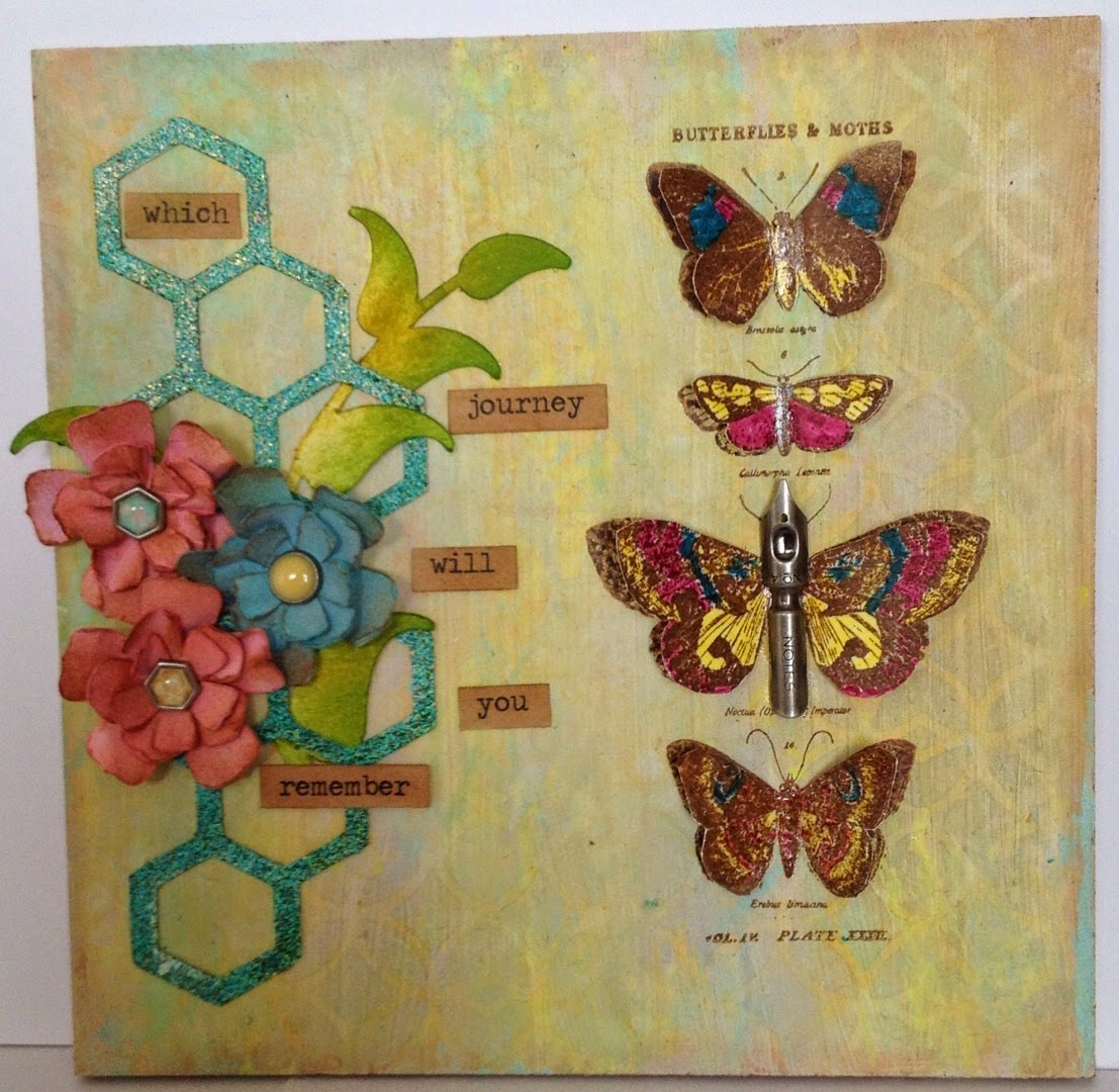
I'm just a teeny bit obsessed with Tim Holtz's Papillon stamps, those butterflies and moths seem to creep in everywhere. What I love about them is that they can be made to look different every time I use them, just by colouring them or adding embellishments.

We recently changed the colour of our living room at home and the lovely Laura Ashley wallpaper we have on one wall has beautiful duck egg blues, pinks and yellows in it and so I decided to make some artwork to pick up on those colours. The plaque below is one of 3, each of which has one or more of those colours in it.

I used mostly Distress Inks for this card. I think the colours were Scattered Straw, Mustard Seed, Squeezed Lemonade and Vintage Photos. The script was done in Archival Ink, but I can't remember whether I used Chrome Yellow or Dandelion. The butterflies were coloured using Distress markers and then covered with Glossy Accents.

I love the vibrancy of the yellow as it is so summery, but with the lace and script I think it looks quite vintage too.

I am going to enter this into the following challenges:
Really Reasonable Ribbon  where the challenge is for something summery and using ribbon or lace
Imagination Crafts the challenge here is to make something with wings

Thursday 8 May 2014

Paris, here we come!

My younger daughter Sarah, aka Sid, and I are planning a trip to Paris in October. I have been several times before, but she never has. Her husband says he has no interest in going and so we decided we would go together and just have some Mum and Daughter time - as she has 2 small children, this is not something that happens often.

So, in honour of our planned trip I made the plaque below. It is a square of MDF painted with one thin coat of gesso and then I put some worn lipstick and pumice stone distress stains onto my crafting mat and wiped the plaque through. I love the colour of the background. grey and pink has always been one of my favourite colour combinations. I even had my bedroom painted in those colours for a while millions of years ago when I was a teenager. I used a combination of stencils, including a fleur de lisle one I made myself and then added some French inspired Tim Holtz stamps. I wasn't sure about the Mona Lisa one, as it is quite prominent, but it has grown on me. Finally I embossed  the Eiffel Tower and the large Fleur des Lisle onto some metallic paper, which I then cut around and gave a coat of black distress paint before adding to the plaque.


CCC3 challenge

A few weeks ago I was given some 6x6 squares of MDF and I have been playing with them to see what I can make.

The  picture below was made using Tim Holtz's Paint Marbling technique which can be found on page 43 of A Compendium of Curiosities 3.  I wanted something light and spring like and I was really happy with it.  I decided to enter the plaque into the CCC3 challenge, details of which are here I have never entered a challenge before, so it's really exciting. I just hope people like this!